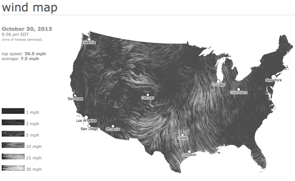
I love the look and feel of live maps that show 'real time' data as it unfolds in the world around us. Two of my favorites - and older wind map, and a newer births and deaths map - are shown below:

Check out the map - Wind Map
Check out the map - Births and Deaths
The problem with these maps are many - from a cartographic perspective they do not provide a level of detail that makes them useful. For instance, you could not plan on a weather or wind outcome from the wind map simply because the scale is not adequate to pinpoint where you are relative to the wind.
The births and deaths map likely takes an annual number of births and deaths for each country and then scales that number over a year. If you ran the simulation for a year, you would see an 'accurate' annual rate for each country, that is reflective of the past. It is not real time data as the creators have no way of knowing, for certain, that the births and deaths are in fact occurring.
The power of these maps, despite their draw backs, is huge. The wind map, for instance, was mesmerizing as hurricane Sandy made landfall on the Easter Seaboard. I didn't care that the data was an hour old because the visual impact of the map was profound - it gave me a glimpse into the power of the hurricane. As with the wind map, seeing 'real time' births and deaths puts a scale to an annual number that I might read in the paper. To see all of those births (4.2 per second) and deaths (1.8 per second) occurring in Africa and SE Asia, and relatively few in N America and Europe provided some insight, still abstract but a little less so, into our global humanity.

