Data

Air Quality Egg: It's all about the data. Part One

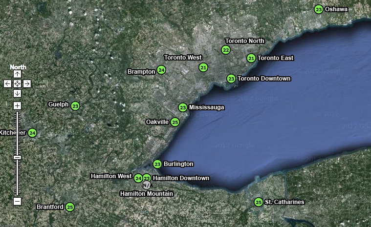
For many reasons the Air Quality Egg represents a profound shift from the current regiem of regulator controlled Air Quality monitoring   Specifically, the current model of AQ monitoring sees a regulator (government) define the AQ issue, the substances of concern, and the monitoring response to these top-down defined concerns.  The AQEgg turns this model on its head by allowing, though citizen lead (though still early adopter) monitoring technology that is accessible to those who can afford a $185 sensor, or have the knowhow to build their own via 3D printers and electronic schematics. In other words, the model shift from top down to bottom up where a citizen, or group of citizens, can define where monitoring should occur. As detailed in this post, the current AQ monitoring network focuses on a regional level of air quality.  For instance, there are three sensors in Edmonton that provide a regional overview of the air quality through a metric called the Air Quality Health Indicator.  Southern and Western Ontario have a total of 15 stations (see map below) that provide air quality data for over 6 million people.

ON_airmonitoring_map

The AQ Egg provides three distinct advantages:

  1. They can be located at street level more easily. We really have no idea what is happening on street level and that the numbers may be well above what the regional AQ network reports.;
  2. The map provided my COSOM is more interactive and open. In fact, developers have already started developing products in support of the AQEgg. See the Air Quality Egg Helper Chrome extension;
  3. The AQ Egg data are open and available for download and analysis.  This open data philosophy is not consistent across all regulators.

The one big advantage of regulator monitoring is the quality of the sensor, and thus the data where the measure of a sensor is the quality of the data it provides. As stated on the AQEgg wiki "...more work is really needed to make the low cost sensors sensitive to ambient pollutant concentrations." This can be seen in the sensitivity of the NO2 sensor as compared to actual ambient concentrations. In Vancouver, for instance (from the 2011 Lower Fraser Valley Air Quality Monitoring Report [PDF], pp. S-9) the annual average NO2 goal for Vancouver is 40 ug/m3 or less, with the one hour range being up to 122 ug/m3. The range of the NO2 sensor is 94 - 9400 ug/m3, less sensitive than the 'normal' ambient concentrations as detected by the regulator sensor.

Furthermore, the quality of the data is confounded by cold (an issue where I am from in Edmonton), and humidity. Regulator sensors heat or cool the air feed to a standard temperature and strip out any humidity to create a 'clean' sample.

My next post, hopefully coming soon, will examine some of the initial data generated by the AQEggs as compared to the regulator data.

Where do accidents happen?

There is currently some debate in Edmonton regarding bike lanes, and the inconvenience that they will provide to drivers.  In particular, Mayor Mandel was quoted as saying:

Not that they’re not a good idea, but it just seems someone behind your scenes out there has just decided we’re going to eliminate all vehicles and only have bikes.

In response, I wanted to look at the number of interactions that cars have with bike or pedestrian in Edmonton. The data.edmonton.ca portal had the appropriate data from 2010 - intersection collisions here, and midblock collisions here. I sorted the data for pedestrian and bicycle collisions with vehicles, and I included all data for bikes and pedestrians, regardless of who was deemed to be a fault. I loaded the CSV data into Cartographica, a lightweight Mac based desktop GIS, and used OpenStreetMap as the base layer for Edmonton.  The results are below, captured as an image (I will work with someone more capable that me to check the data and to get it on line in an interactive format).  Legend: red/yellow diamonds are intersection collisions, blue/blue diamonds are midblock collisions.  The numer adjacent to each diamond represents an aggregate of pedestrian/bicycle interactions with motor vehicles. .

Where accidents happen between cars and other transport modes in Edmonton.


Some things to note:

  • More collisions happen at intersections (90 in total) than midblock (22 in total).
  • The most dangerous intersection in 2010 was Fort Road and 66 Street, with 4 collisions.
  • The most dangerous stretches of road were Gateway BLVD north of 51 Ave, 109 Street north of Whyte, and Calgary Trail north of 34th Ave.
  • Midblock collisions saw 18 pedestrians and 4 cyclists injured.
  • Intersections saw 65 pedestrians and 27 cyclists injured.

Conclusions

There is a greater safety issue at intersections where advanced pedestrian and cyclist activated lights should be installed in conjunction with bike lanes.  Furthermore, if the bike lanes are being considered for safety reasons, residential street speeds should be lowered from 50 km/hr to 30 km/hr.  There is convincing data that cars travelling slower inflict less damage than tose travelling faster - see this WHO report [PDF].

Finally, if the City of Edmonton were serious here, they could conduct an interesting study to track accident rates with cyclists and pedestrians give the introduction of bike lanes, intersection controls and low residential speed limits.

Towards Data Driven Urbanism

We’re a city of nearly 800,000 people, and we’re basing the public involvement part of the decision on 80 comment forms and 15 interviews? I truly believe more people want to provide feedback, it’s just too difficult to do so at the moment. Mack Male, in a blog on Public Involvement.

A recent blog post in the Charette.ca discussed the idea of DYI Revitalisation, where a bunch of citizens, business owners and associations get together to host evens such as the 104 Street Block Party.  There are several benefits that arise from closing down a few blocks of a downtown street that include building a sense of community, connecting citizens with the local business, artests, musicians, each other. While the 104 Street Block Party is an awesome event that highlights what a place can be, it is a shallow way to engage citizens in a meaningful discussion of urban planning and development. In my view there are four practical "levels" that citizens can be engaged on: (1) a Charette where citizens attend municipally sponsored meets that address specific issues such as the Walter Dale Bridge Project, or the Arena; (2) DYI Revitalisation such as the 104 Street Block Party; (3) Tactical Urbanism, and ;(4) Data Driven Urbanism. We need all four to successfully engage citizens and municipalities, but we are currently operating at the first and second levels.

Tactical Urbanism (TU) is much like open source software development which seeks to produce consistent but incremental change over time.  This requires frequent releases involving input from all who are interested in specific local projects. TU is implemented in an urban environment through experimentation (i.e. a single $500 bench rather than $10000 worth of benches) that supports (requires) feedback from citizens. Citizens are also empowered to claim their own space with paint and small infrastructure improvements (putting in a local bike lane, speed bump). The goal is to get people involved with the local through "a deliberate and sometimes experimental phased approach to instigating change. The result is the development of desirable locations and social capital between citizens, local government and businesses."

Data Driven Urbanism (DU) recognizes that the world of citizen engagement is changing with mobile devises proliferating our urban fabric even as the GeoWeb develops as a platform that enables crowdsourced mapping.  DU recognizes that truly participatory planning must go beyond drawing on flip charts and maps and  requires a plethora of open data sets, a platform of engagement and building long term relationships with developers and engaged citizens.  What would it look like if we could GeoTweet a downed tree in a river valley path such that the River Valley Rangers received it; that these tweets were mapped?  Now imagine if we could use the tools in our pockets - iPhones, BlackBerries and all other GPS, camera and connected mobile devises to provide feedback to our Municipality on what works and what does not.  While there are privacy and behaviour concerns, these concerns are navigable and can be addressed.

The gap, as I see it, is a City wide strategy to address public involvement using new technologies and approaches.  As great as the IT department is (and they are great!), they are too few to enact widespread change within the City of Edmonton bureaucracy. Immediate improvements that could be made tomorrow include higher standards for developers.  For instance, why are they not required to produce 3D files for Google Earth that would allow citizens to engage with a developers vision? Why are public consultations limited to old style Charette, surveys and questionnaires?  It is possible and desirable to engage with citizens via an on-line map that supports geo-located comments, wikis or discussion forums.

Within geography it is commonly understood that people are experts of their local environment.  Lets engage with all who would have something to say about their locality via different and varied channels that include face-to-face meetings in addition to web-based consultations. The combined technologies of smart phones and the web as a consultation platform would offer a data driven approach to urbanism that might provide insight into what makes a location a place.