GeoWeb

QGIS, TileMill and MapBox, oh my. Or, web mapping tools I am learning to use.

How do you make a web map?  

This is the question I have been exploring for the past while as I try to expand my basic knowledge of GIS beyond the ARC.  As a result of this exploration, I have put a few maps on-line, developed a keen passion for map making and an interest in expanding my skills.  This post comprises a list of my mapping tools - those I currently use, those I am actively learning, and those on my list to learn. The geo-stack that I am working toward comprises of the following:

  • PostGIS - works as the spatial database for storing and serving the data to either QGIS or TileMill
  • QGIS + TileMill - QGIS is a great tool for analyzing and processing data, TileMill makes it look good and allows an export of MBTiles.
  • PHP Tile Server - This serves the MBTiles onto the internet.
  • Leaflet JS - Leaflet provides the user interface allowing someone on-line to interact with the MBTiles.

While I am learning the components of this stack, I use other things, described below.

Web mapping tools I use

Open DataOpen data forms the basis for most of my base map data. Open Street Map extracts allows me to build interesting, complete and free base maps, and various open data portals offer data for mashing. My goto data portals are:

OpenStreetMap - I am a minor contributor to OSM, and mainly use it as a database for urban, Edmonton, data.  For instance, an ongoing project is to classify each building by type (apartment, commercial, etc) in downtown Edmonton so that I can update my DTYEG map and create an accurate land use map of #yegdt. Cartographica - I mainly use Cartographica as a desktop geocoder, quick and dirty data viz tool.  I love how simple it is to dump data into the view window, and how quick it renders large data sets.  It is a light and easy way to quickly get a sense of a dataset, plus it has a 'live' map feed of OpenStreetMap or Bing. It can import or export to KML, and complete some lightweight data analysis like heat maps. QGIS - Where Cartographica is light, QGIS is robust.  A free way to get a full GIS on your desktop, and because I run an iMac, the easiest way to do spatial analysis without loading a Windows VM (and much cheaper too, as in free).  I love QGIS, but it requires a set of skills comparable to those used in ArcGIS.  I am still building this skill set. TileMill - TileMill is awesome. A super easy to use map style machine by MapBox, TileMill uses CartoCSS (Cartographic Cascading Style Sheets) to code the look of each point, line, polygon and raster within your map.  It renders maps fast and beautiful, and dumps them in a variety of formats, including MBTiles, which you can then load onto the MapBox site for a fully interactive map experience. MapBox - MapBox provides two services that I find vital - (1) web hosting and (2) base maps that can be styled. I am not yet skilled enough to take the MBTimes and put them online myself, so I rely on a MapBox subscription to host my maps.  If I am working with a large geographic area, and am not yet skilled at dealing with huge data sets, so I also use MapBox's base map, from OSM, which can be made custom. Also, MapBox provides some great satellite imagery as a base map, and an awesome blog on what is new in mapping.

Web mapping tools I am learning

PostGIS - I learned recently that the cool kids pronounce this as Poist-jis NOT Post G-I-S.  PostJis is hard and I don't really get it - it is a OSS project that adds support to geographic data within a PostSQL database.  I have been working with a Refractions Research tutorial, and have been able to install PostgreSQL and enable PostGIS, but I am unfamiliar with SQL so I find it hard even knowing how to compose a command.  Lots to learn here.  My PostGIS resources include:

CartoDB - I love how CartoDB makes temporal data come alive.  Check out this map of '7 Years of Tornado Data', and how you can almost pick out the season by the amount of tornado activity.  Apparently you can style the map in CartCSS (which I can do), combine various data sets, and run SQL queries.  Much to learn. Leaflet JS - "Leaflet is a modern open-source JavaScript library for mobile-friendly interactive maps". It's a UI that enables the user to interact with the MBTiles like: MBTiles > PHP Tile Server > Leaflet > User.

Web mapping tools I want to learn

Below I list a bunch of tools that I want to learn, but an still coming to grips as to what they do, and how they interact.  For instance,  I can picture the workflow of data from PostGIS to TileMill to MapBox, but I cannot picture the workflow from TileMill (MBTile output) to PHP Tile Server, and the role that JavaScript and HTML play in the creation of a hosted map (ok, I kinda get it, but not in a concrete, I have done this way). If I get anything wrong here (or anywhere in the post) please let me know - also, if I am missing a great resource, make a note of it in the comments. PHP Tile Server - PHP Tile Server translates the MBTile file onto the web and acts as an interface between the MBTiles and an UI such as Leaflet JS or even Google Maps. HTML - HTML provides the backbone of every website.  Learning to code HTML would simply allow me to create and style the webpage that my MBTiles are displayed upon. JavaScript - Like HTMP, JS is a programming langauge the provide some sort of function to a website.  Where HTML is static, JS is dynamic allowing the user to interact with elements of the website.  For instance, in a mapping context, JS would allow me to define a set of layers that a user could turn off and on to expose of hide specific types of data on a map.  Plan Your Place has a great interactive flood map of Calgary that illustrates this function.

GeoJSon - A JS derivative  (as is TopoJSon) of JS that codes spatial data such as point, line, polygon.  In the web mapping context it is a much more powerful format than ESRI Shape Files as it is lighter (i.e. quicker) and can be integrated into the code of the map.

Resources

This is not a complete list - in fact it is barely a list.  Please add a comment to point out what I am missing.

  • Code Academy - A free on-line coding tutorial that is interactive and problem based.  They offer tutorials for JavaScript, HTML, PHP and help you learn how to build web projects.  Very cool and free.
  • GitHub Learn GeoJson - GitHub is a place where programmers, especially those working on the OSS space, keep their code for others to download, use and improve upon. This is made by Lyzi Diamond.
  • Maptime! - An awesome list of mapping resources by Alan  McConchie (@almccon) and Matthew McKenna (@mpmckenna8).
  • Spatial Analysis On-line - As I try to remember my GIS courses, this is the on-line text that I reference to help me understand the analysis I want to run.
  • Mapschool - Tom MacWright wrote this as a crash course in mapping for developers.

Colour and Maps

These are the colour palette websites that I reference:

Finally, NASA has a great 6 part series on colour theory called the "Subtleties of Color".

Toronto Tweets

There is an emerging narrative that characterizes Twitter as a tool of public engagement that can augment more traditional means of consulting with the public (for instance, see here for Environment Canada's commitment to "...implementing more avenues to facilitate online connections with partners, stakeholders and interested members of the Canadian public") .  While there is no doubt that there are many many people who use Twitter (it is reported that there are over 200 million active Twitter accounts)  as a mean of conversing with their elected officials, it is important to remember that Twitter does not include all voices within our Canadian cities.  This blog post is an attempt to understand who might, in fact, be Tweeting within Toronto in a effort to understand who might be Tweeting about Toronto. About this map

A year of geolocated tweets, representing about 5% of the total number of tweets for 2011

[mapbox layers='mattdance.toronto_tweets' api='' options='' lat='43.65969596299056' lon='-79.38002295227051' z='15' width='600' height='400']

Above are Twitter maps of Toronto that represents all of the geolocated tweets for Toronto in 2011, about 1.5% of the total Tweets (in other words, 98.5% of Tweets are not location enabled). The Twitter data were provided by Trendsmap through John Barratt (thank you!). A full sized version of the dynamic map can be found on the Map Box site.

This was a challenging data to work with as it is so large.  I started in QGIS to understand how the data looked and to pair it down to just tweets within the GTA.  I moved the data into Tile Mill by Map Box, and layered Open Street Map data to provide visual context for the tweets. The 'heat map' effect that I used is described here, as I was not able to make the QGIS heat map plugin work, for some reason (please let me know if you can help with this).  I plan on learning how to build a PostGIS database on my computer so that I can do this.

The idea for the map and post came from these three beautiful and interactive twitter maps: (1) London, (2) New York and, (3) Melbourne.

Observations and analysis

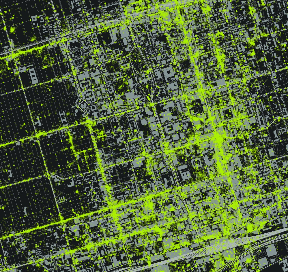
A closer look at the map reveals very dense Twitter areas and areas that are very sparsly Tweeted. The most densely Tweeted area is bounded by Bloor Street to the North and Lake Ontario to the South, connected by Young Street.  There is a greater density along the Lake, away from Young to the West. There are also a small number of ghost Tweets on the lake North of Toronto Island.

Area of Tweet density - Bloor to Lake along Young.

These boundaries are visible in the above image.  There are also a couple of identifiable hot spots - the Eaton Center, Rogers Center (cut off in the above picture).  The areas described by this Twitter Density also corresponds with the tourist and suburban destinations - the areas around Young - Bloor - and Front Street, including the sports stadiums, are not just neighbourhood destinations, but destinations for those interested in shopping or taking in the sights in Toronto.

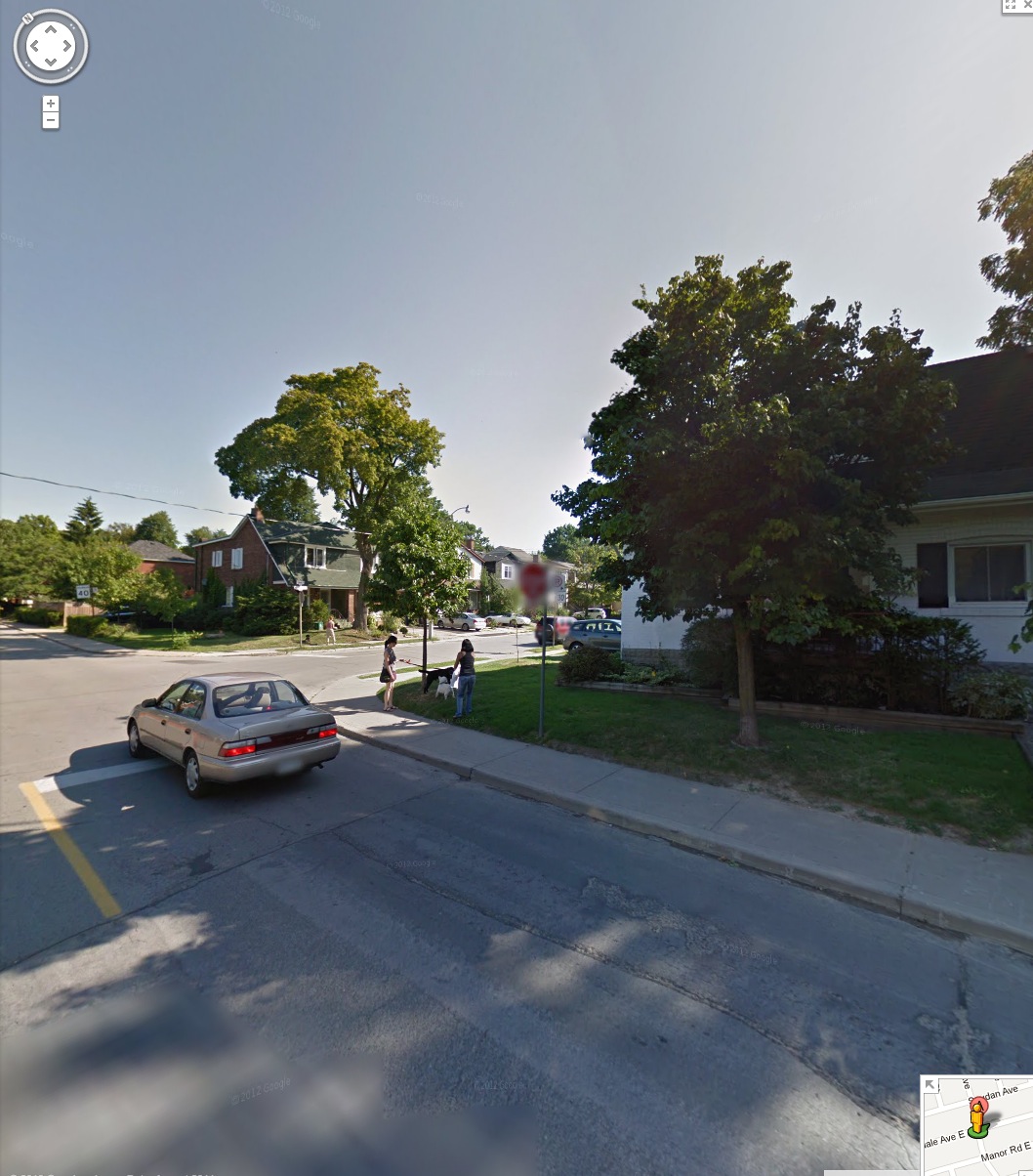
In contrast, those areas that are strictly neighbourhoods, such as Hillsdale Avenue (running east from Young) do not offer that same density.

to_tweets_5_hillsdaleave

The above example shows a middle class neighbourhood within Toronto that does not have a large number of Tweets other than the cluster at the corner of Young Street and Eglington Avenue in the top left of the image.  The Mt Pleasant Cemetery bounds the neighbourhood to the South.

Hillsdale and Forman, Toronto

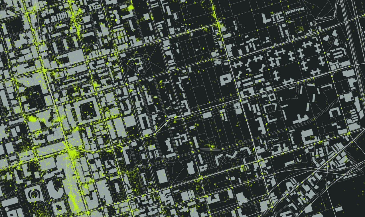
In addition, poorer neighbourhoods also seem to have a dearth of tweets.  The following image is of the Regent Park area between Dundas and Gerrard.

Regent Park to the East, Young and Dundas Square, with a hot spot of Tweets, to the West.

It is clear from the image that many people are Tweeting on Young Street.  You can even see a hotspot in the Eaton's Center and at the south east corner of Young and Dundas.  Further east, nothing.  From the Regent Park Wikipedia page:

The average income for Regent Park residents is approximately half the average for other Torontonians. A majority of families in Regent Park are classified as low-income, with 68% of the population living below Statistics Canada's Low-Income Cut-Off Rate in one of its census tracts, and 76% in the other (compared to a Toronto-wide average of just over 20%).

Conclusions

I suspect that most of the Tweets that occur in Toronto are from those who live in the region, but who may be downtown for some shopping, to take in a game, or other recreation.  I also suspect that a majority of those who live in Toronto are a small portion of the overall Tweets in the area between the Lake and Bloor, adjacent to Young.

As you move from this area, I suspect that a greater portion of Tweets are made by residents of those neighbourhoods, simply because fewer 'tourists' would travel to these neighbourhoods unless there was an attraction, such as shopping or food.  Although I am only exploring those ~1.5% of tweets that are geolocated, I feel that these are the Twitter users who are most likely to engage with an Open311type of application, to use their smart phones as a means of communicating location details to their municipality.  If this is the case, then those poor areas of the city, potentially the most disenfranchised, will become more so (look at Mark Graham's work mapping  the digital divide in Francophone Africa).


AQ Egg: First impressions

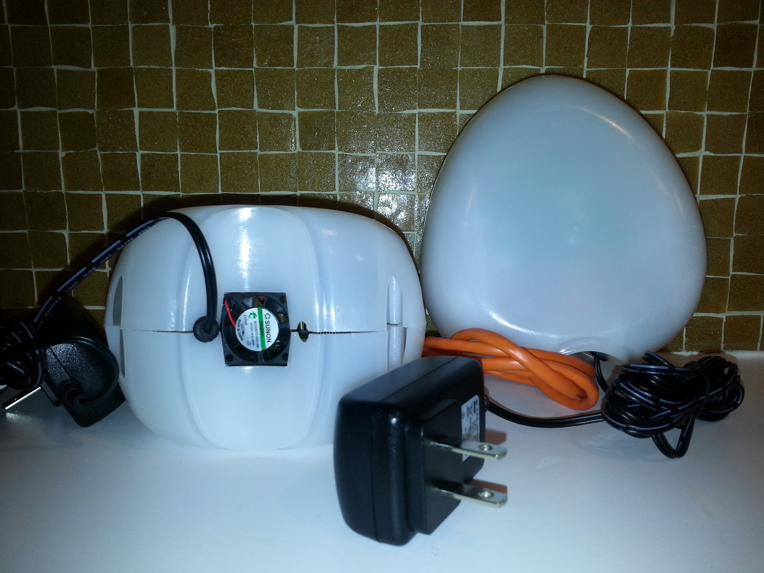
Air Quality EggMy Kickstarter contribution has finally paid off!  My Air Quality Egg has arrived in the mail!  To recap, the AQ Egg over-reached its funding goal in April 2012.  The project had asked for $39 000.00, and raised over $144 000.00 with 927 backers.  Impressive.  And scary.  As we soon learned, their were high expectation, and the egg almost hatched as vapour-ware (an impressive timeline can be found here). In short, what was promised in July 2012, was shipped in January 2013.  What shipped, sadly, is not what I had expected. Given the extra time that was used to create the egg, I was disappointed at how 'cheap' and flimsy it felt. In removing it from the shipping box, the sensor pictured at the base of the left egg became loose and fell out.  The egg, which is 'snapped' together via a vertical seam that runs around the device, was not properly 'snapped'. It was loose and I was able to easily pull the shell apart.  Furthermore, when reading the directions on how to set the sensor up, I was surprised to learn that they shipped some of the eggs, and unknown numer of them, with a software bug (the details here).

Needless to say, these are annoying details.

But, I am still a fan.  While the NO2 sensor is not sensitive enough to pick up all but the highest spikes in NO2 (that we know as no one has consistently monitored busy roadways in Edmonton), it feels cheap, and it arrived months late, it still represents a remarkable revolution.  No other AQ sensor offers such easy and inexpensive citizen access to AQ monitoring. Granted, you have to be rich and technically literate to deploy one of these things, but it is a step away from government controlled monitoring. It is possible to build or purchase at a low cost, and it is complete open sourced.  In other words, you can download a component list, 3D printing schematics, and the code to build and launch your own sensor. I have to remember that I received a V.1, and as with many V.1, there are issues. But these issues will get ironed out in successive iterations as more people look at, and improve upon, the egg.

You can learn more about the Air Quality Egg here , and you can view my (empty for now) data stream here. I'll update this when I have my egg feeding data to the web.

Urban GeoWeb 1

This is an inaugural post, the first of a series that will explore the intersection of the Urban with the GeoWeb and Social Computing.  My interest is specific to data visualisation, collaboration and access to resources that will enrich citizens experience living and working in urban environments.  The GeoWeb is emerging (has emerged?) as a dominant platform by which people consume, generate and communicate spatially relevant information that is a reflection of their use and experience interacting with urban areas. Social Computing is that cloud of information and people / groups that surrounds us all, and that we access via a mobile devise or computer.

Transit is an obvious way to incorporate several data streams - open transit data which describes the bus schedule and bus stop locations, potentially GPS from individual buses - all displayed on an interactive map interface that supports queries.  This is standard.  Mapnificent is not standard as it displays all of the Google enabled transit maps in the world, and provide the user travel times.  TripTropNYC creates a travel time heat map from any location of New York. Boston's Street Bump app utilises a smart phone's GPS and accelerometer to provide a realtime view of the state of Boston's roads.    I love this this type of application development is seeking to crowdsource, through citizen based sensors, less expensive ways to track urban infrastructure.

Sustainable Cities Collective expands on this theme by discussing WikiCity as a way to engage citizens in city improvement:

Local groups all around the world are taking the initiative and are building the infrastructure that governments refuse or are slow to do.

Charlie Williams, an UK based artist, has created some very cool looking Air Boxes which provide realtime feedback to citizens on the quality of their air.  These boxes sit at street level and simply shows a red, orange, or green graphic depending on the quality of the air.

Finally, the  MIT Sensable City Lab hosted a Future Cities forum that brought together a number of leading thinkers, including Carlo Ratti the Lab's director, to discuss future cities.  The video of these talks can be found here.

I'll close with these words from the Future Cites website:

Over the next few decades, the world is preparing to build more urban fabric than has been built by humanity ever before. At the same time, new technologies are disrupting the traditional principles of city making and urban living. This new condition necessitates the creation of innovative partnerships between government, academia, and industry to meet tomorrow's challenges including higher sustainability, better use of resources and infrastructure, and improved equity and quality of life.